Ever finished editing a video, feeling great about the cut, the pacing, the color, and then lost twenty minutes just staring at a font dropdown? You're not imagining it, and you're definitely not alone. Almost every editor treats typography as an afterthought, something you deal with right at the end, once everything "real" is already done.
Here's the thing though: that's exactly backwards, and once you see why, you can't really unsee it.
Typography isn't decoration. It's a signal.
Think about how fast you react to a piece of content. Before you've even read the words on screen, you've already got a feeling about it, whether it's serious, playful, urgent, calm. A lot of that feeling comes from the typeface, not the message itself.
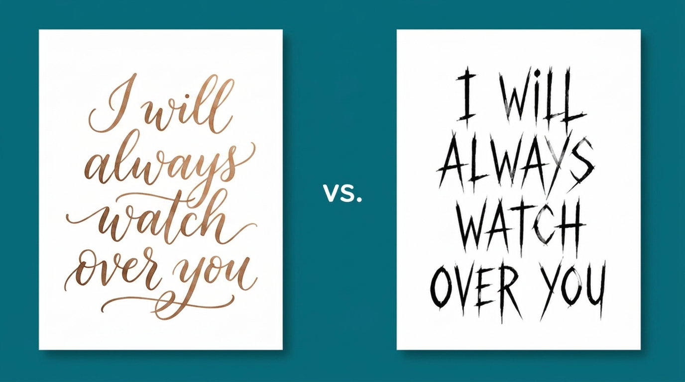
Take the example above. "I will always watch over you," written in a soft, flowing script, feels warm and protective, maybe even a little sentimental. Now look at the exact same words in a sharp, all-caps, tightly-spaced type. Suddenly it feels tense, almost like a threat. Nobody changed a single word. The letters did all of that work by themselves.
So the question was never really "which font looks nice." It's "what am I trying to make someone feel right now, and does this typeface actually say that?"
The problem was never a shortage of fonts
If you've ever opened a font menu and felt your eyes glaze over scrolling through fifty options, you already know the real issue. There's no shortage of fonts — there are thousands of them, free, sitting right inside your editing software. More options don't make the decision easier. They usually just make it slower.
What's actually missing isn't more choices, it's context. Knowing the story you're telling, the emotion underneath it, the pacing, what deserves emphasis and what doesn't, before you ever touch a font. That's less about knowing fonts and more about thinking like an editor.
What good editors do without even realizing it
Watch someone who's genuinely good at this, and you'll notice they're not really comparing fonts side by side. They're reading the clip first. Is this moment urgent or calm? Sincere or a little ironic? Fast and punchy, or slow and lingering? The typeface just follows from that read.
Ask them why they picked that specific font, though, and most of the time you won't get a clean answer. It's instinct, built up over hundreds of projects, and it's rarely something anyone actually teaches. That's the part that's hard to scale. Not the fonts themselves — the judgment behind them.
And it matters more now than it used to
Content moves fast these days. Reels, ads, shorts, all competing for a second or two of someone's attention before they scroll past. In that world, the difference between content that feels intentional and content that feels like everything else usually comes down to typography, more than people realize.
That's really the problem worth solving. Not another pile of fonts to choose from, but a way to bring that same editorial instinct to every video, instantly, without needing years of experience to get there.